Naked Harvest
Branding
Packaging
Stationery
Website
UX
Social
Strategy
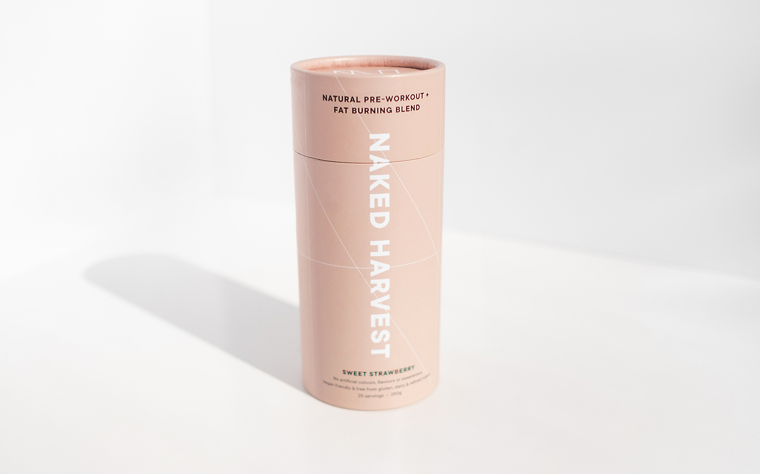
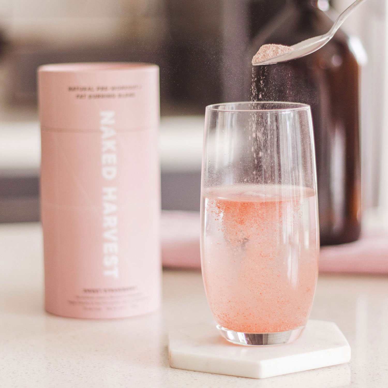
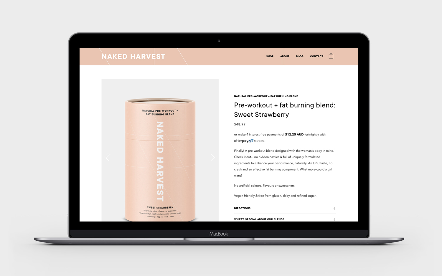
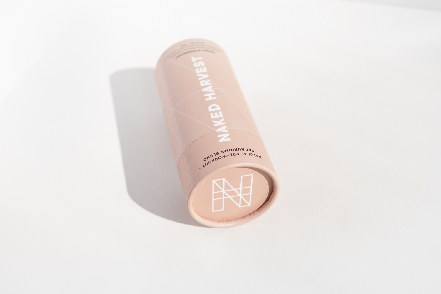
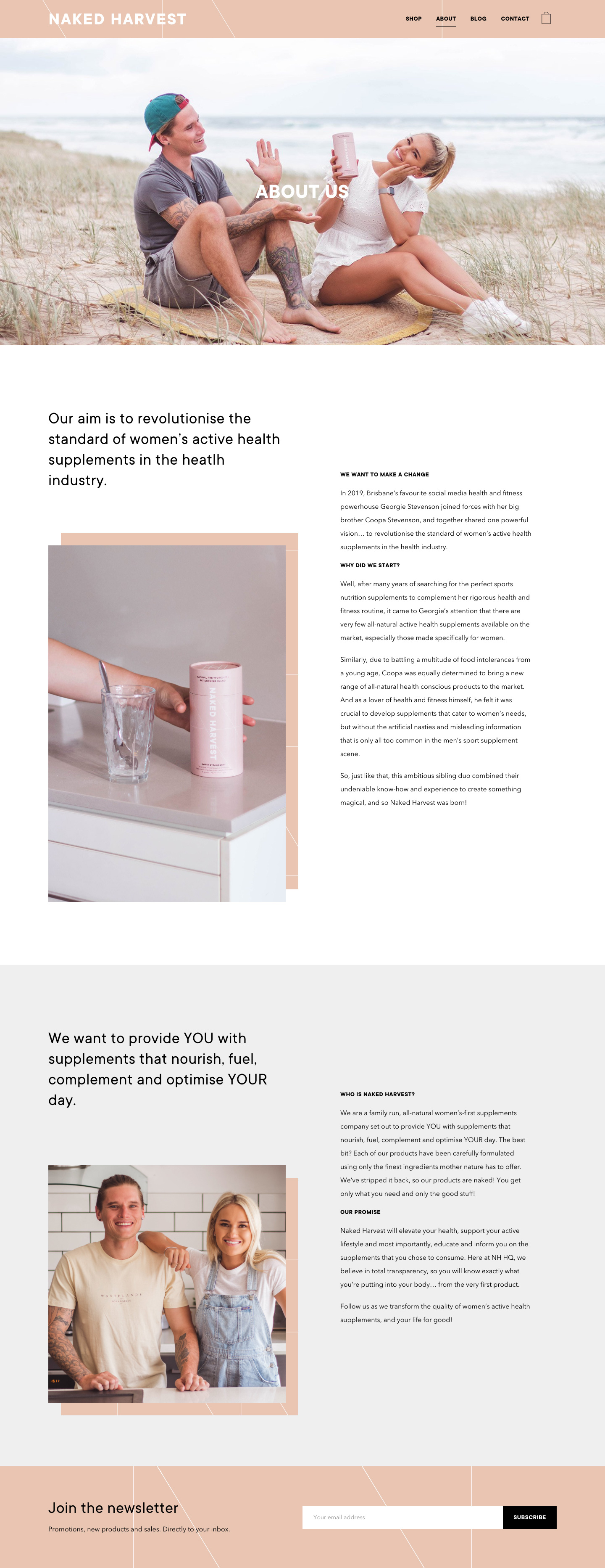
Naked Harvest is on a mission to shake up the supplement world with products that are natural and transparency in their ingredients. We used natural nude tones, minimal and clean layouts, and outlined typography all as subtle references to the ‘nakedness’ of their products and philosophy.
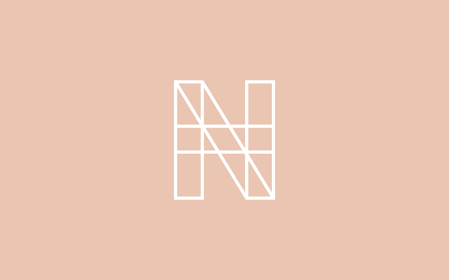
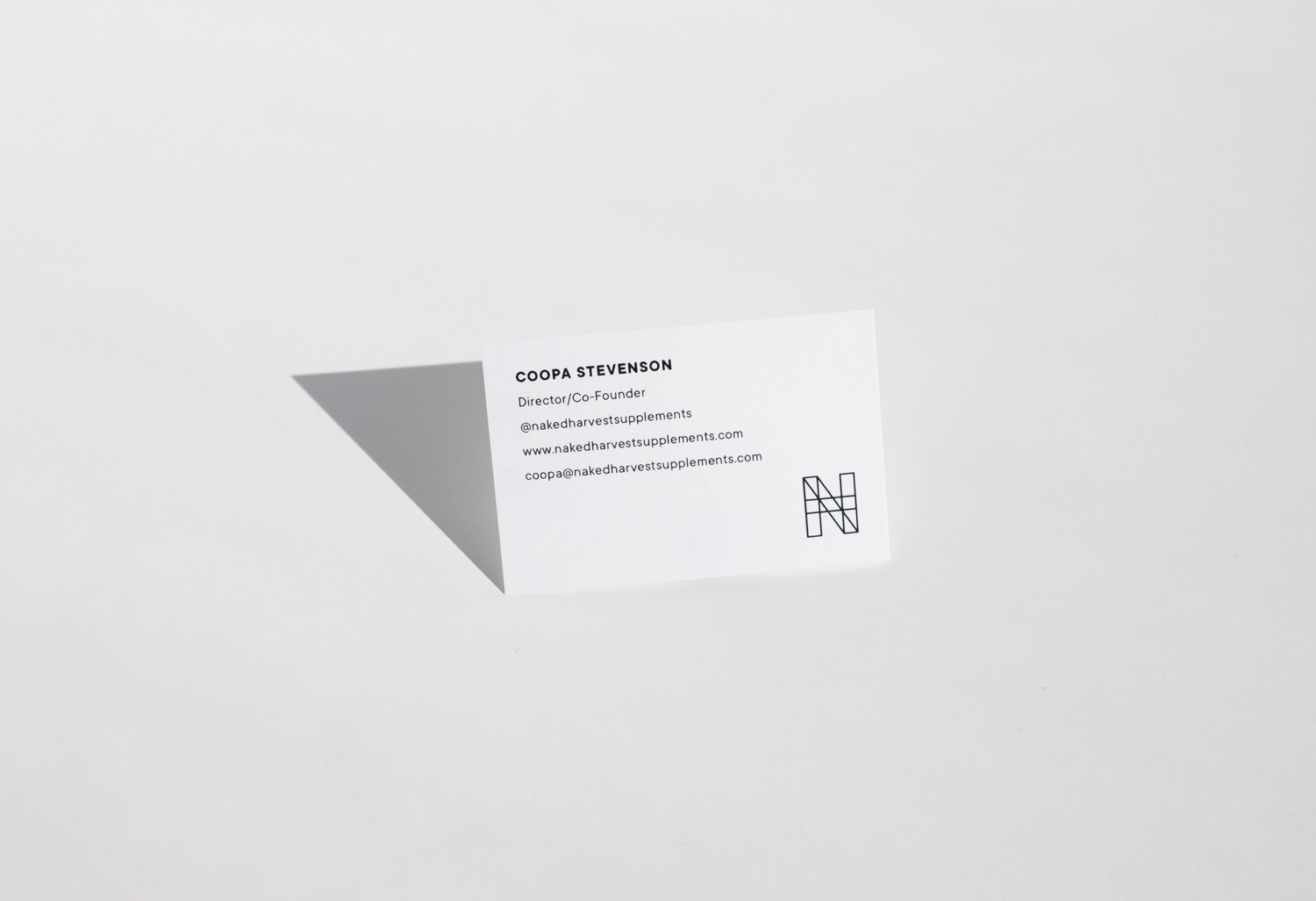
The icon was particularly fun as we combined the N & H from the main identity in outline form, this we then used as a subtle pattern on the packaging, website and instagram as an extra brand element; giving it a bit of a sporty edge.
