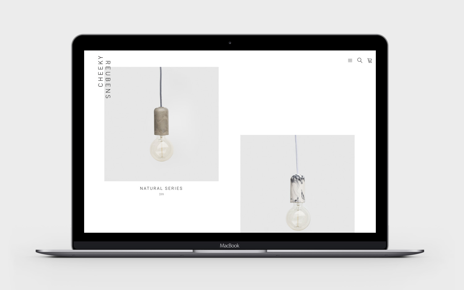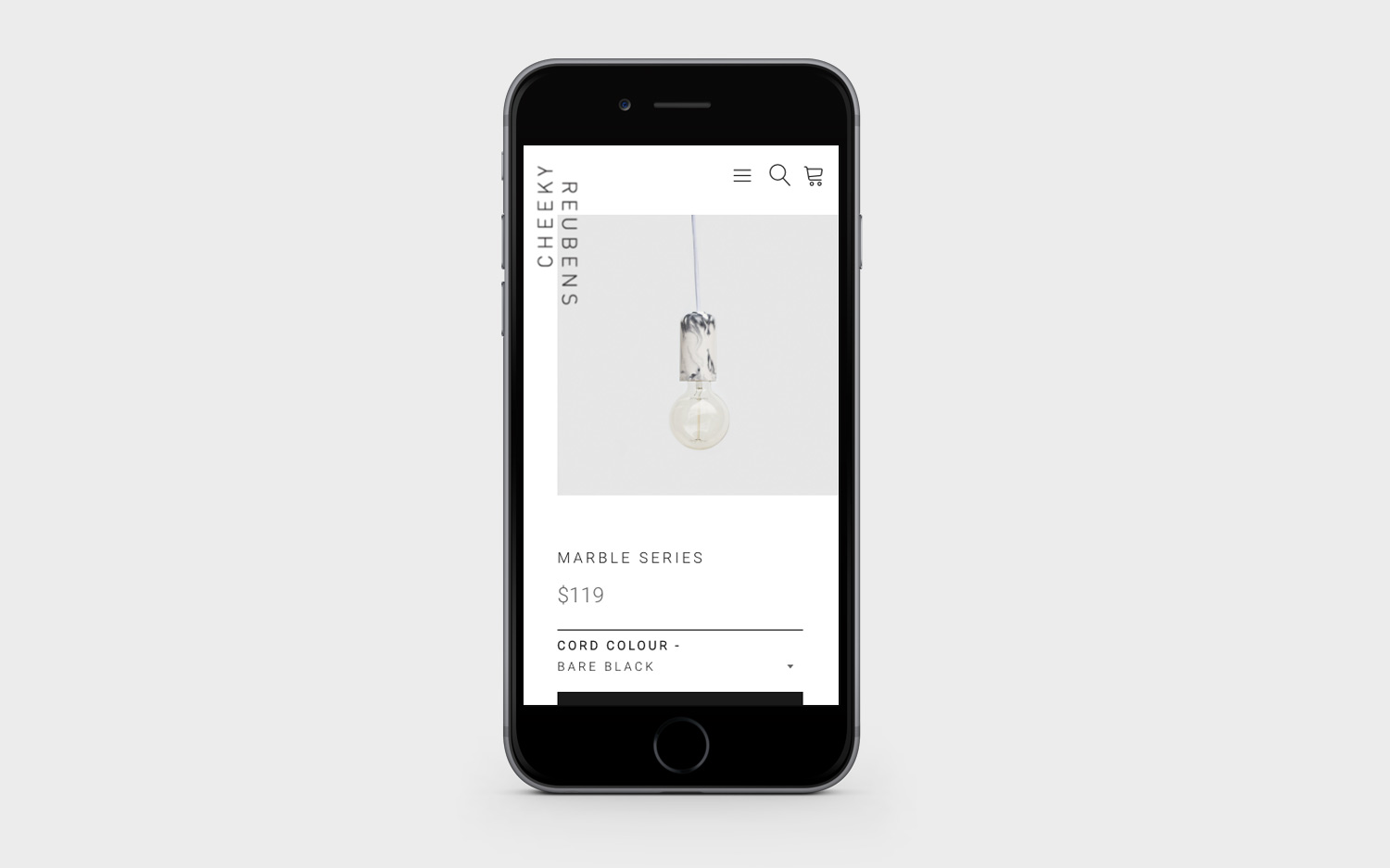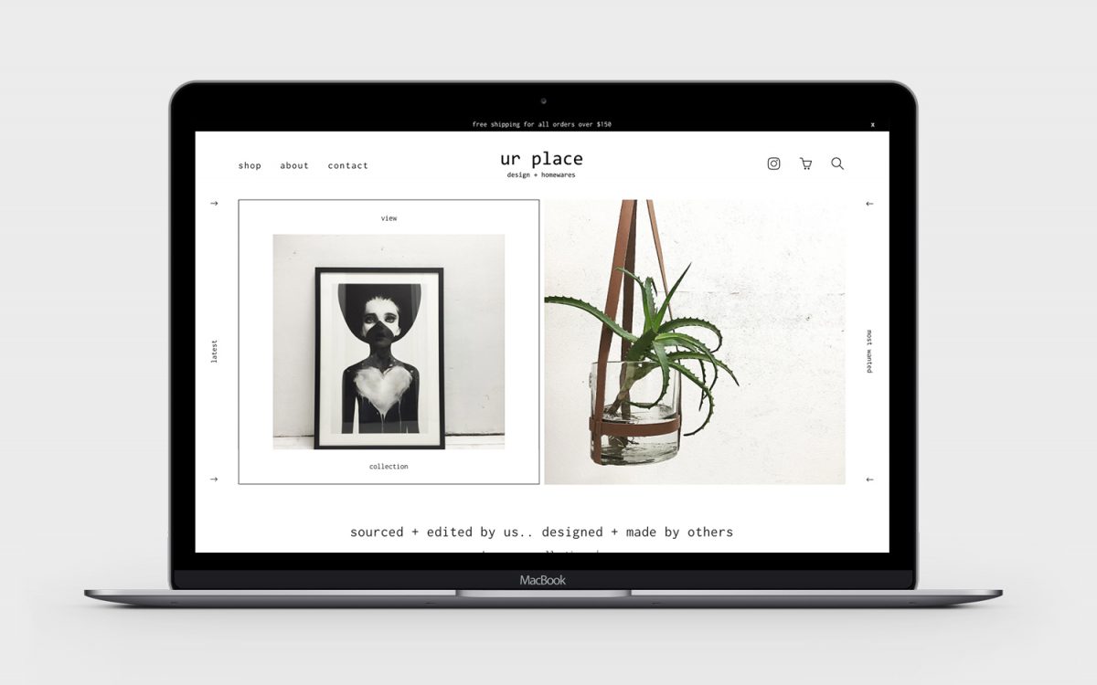
The legends at ur place have more style than anyone we know. Shopping in their gorgeous shop is always exciting (and dangerous for the wallet) with new and different finds on every surface. Our goal was for the website to be an extension of their beautiful shop, with the online browsing experience to be as close to the in-store experience as possible, and just as enjoyable.
Check it out for yourself now: urplace.com.au
(and don’t say we did warn you about your wallet!)
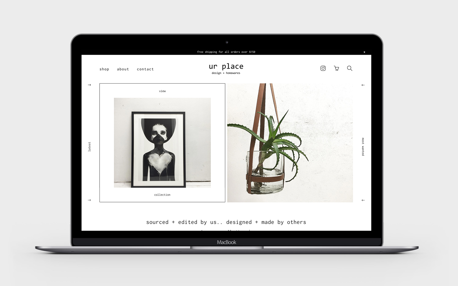
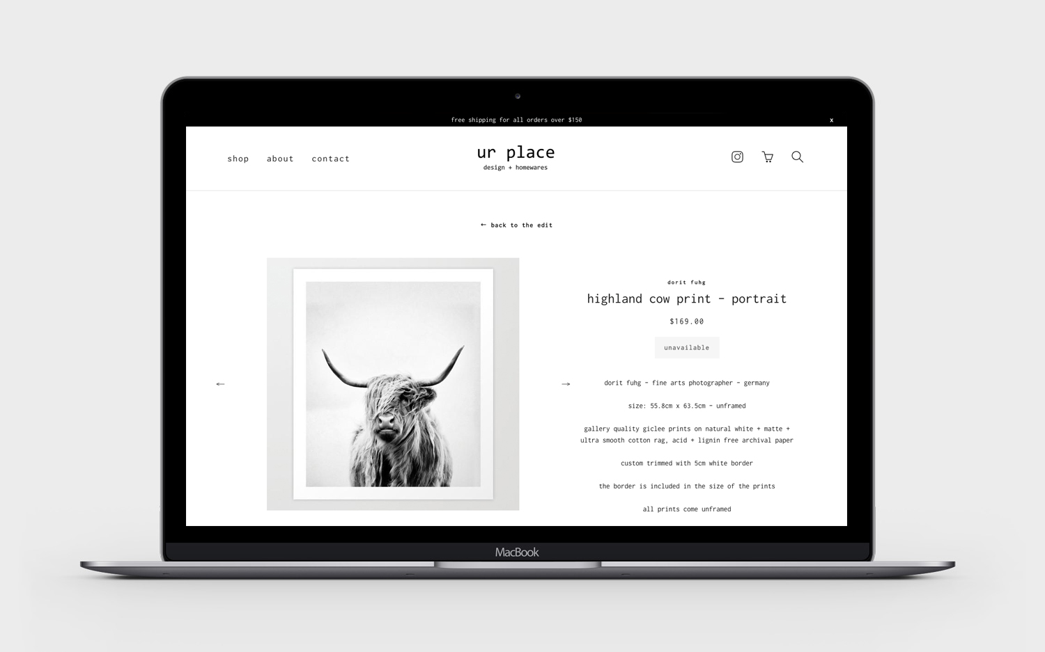
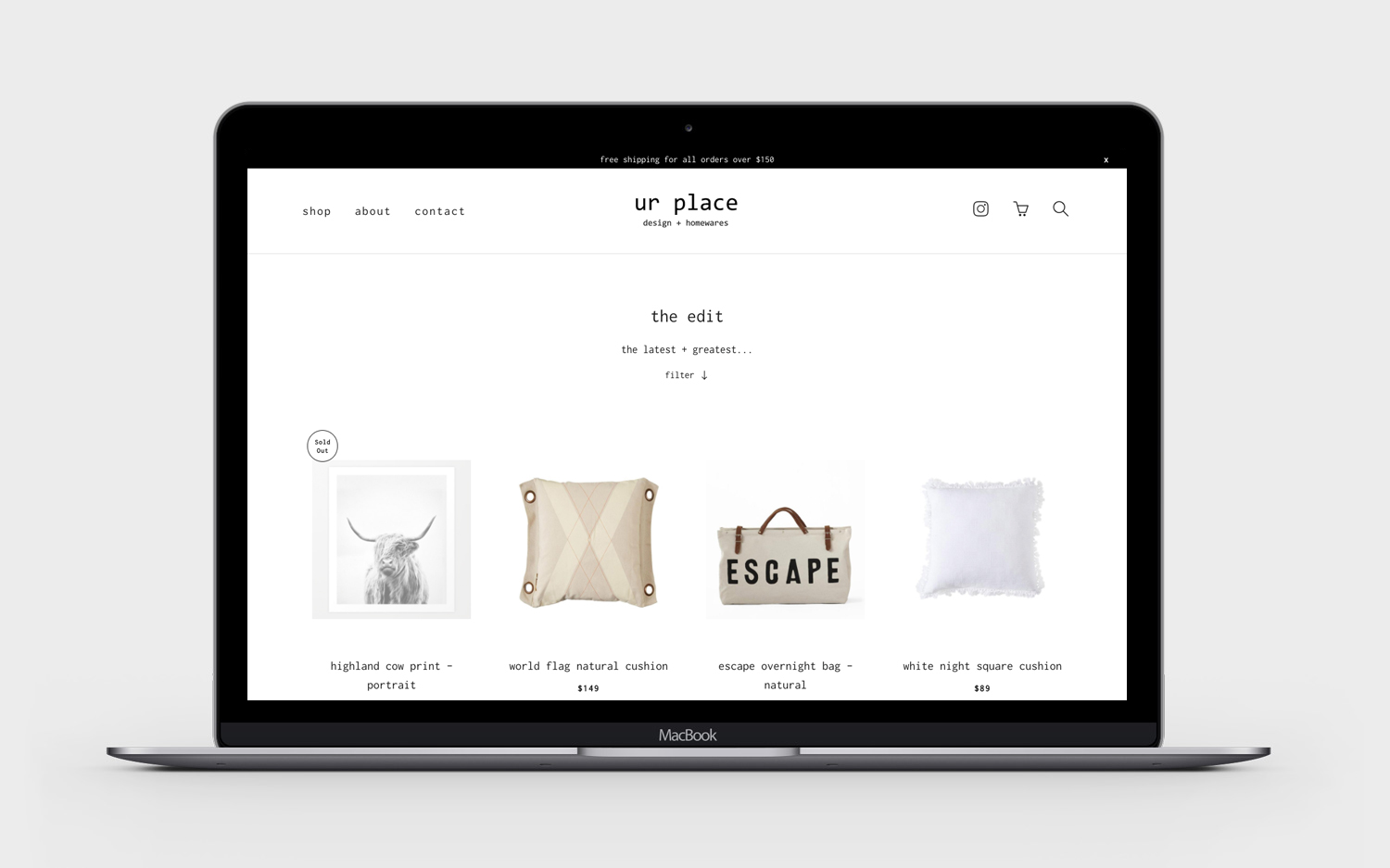
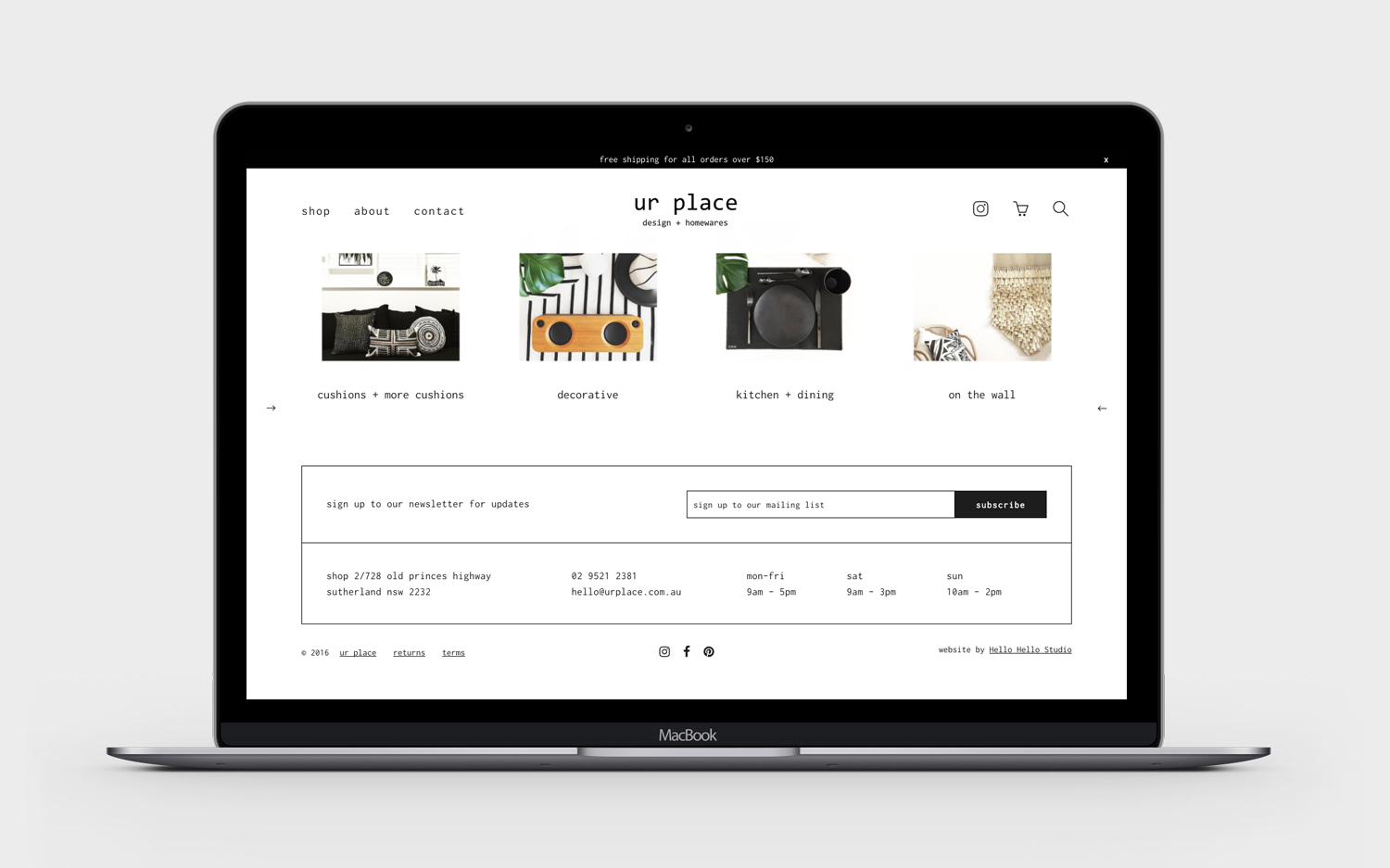
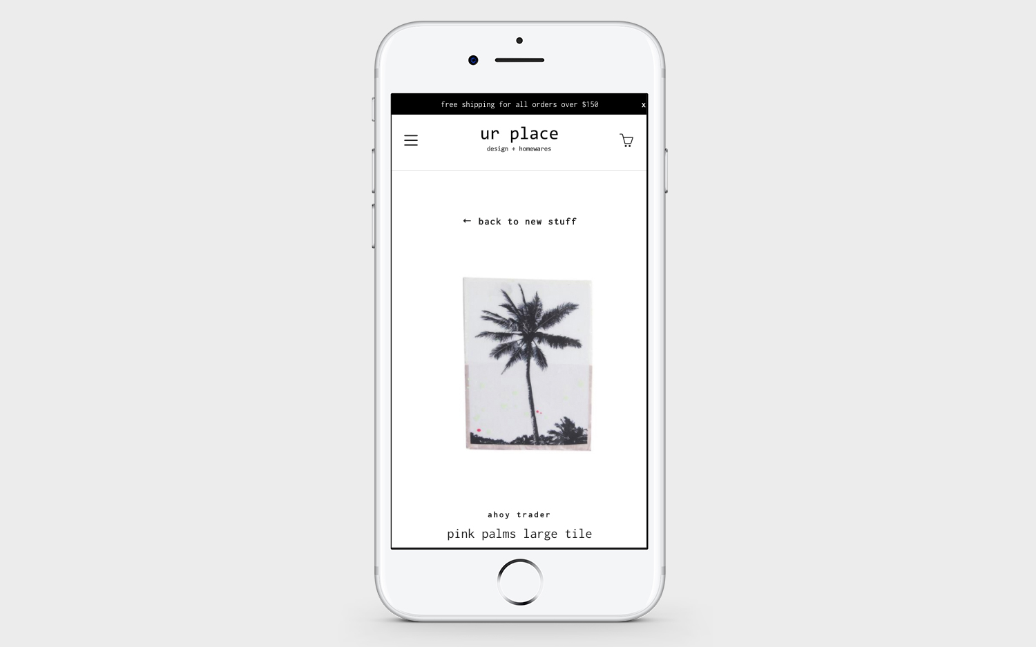
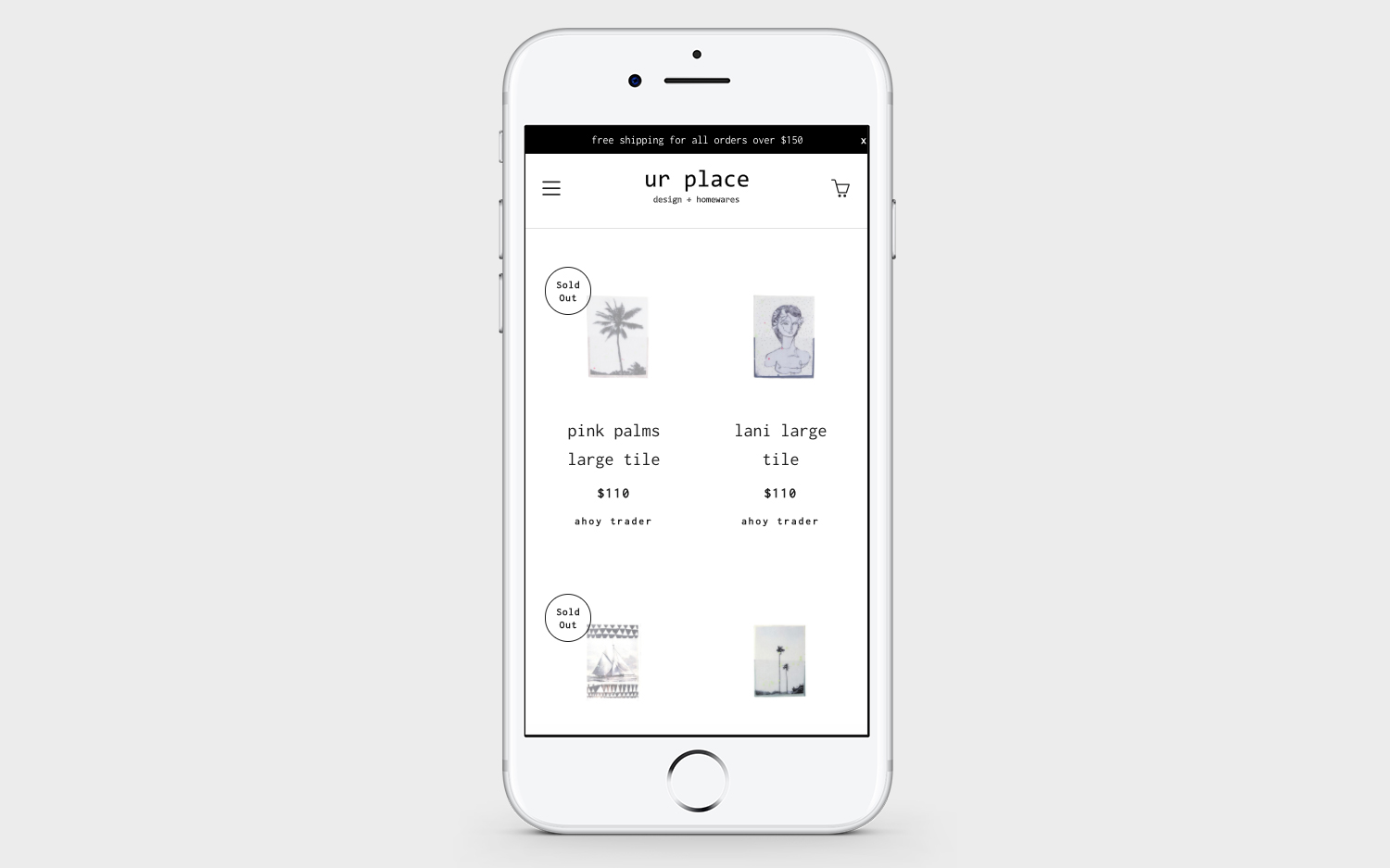
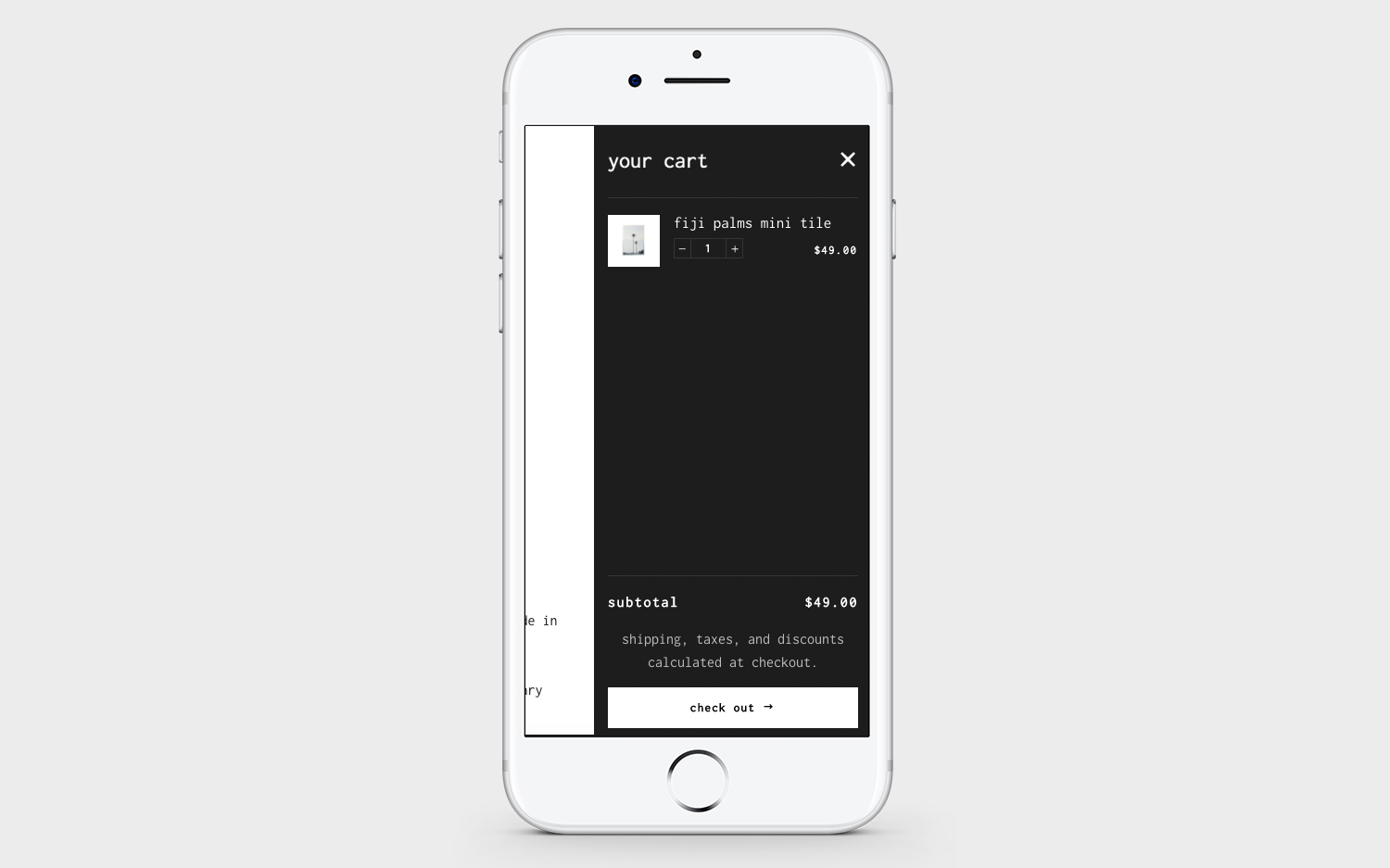
website design/build using shopify platform